 Paper
Paper
In collaboration with Keuledruck
Pantone and HKS
CMYK (Cyan, Magenta, Yellow and Key/black) only allow a limited representation of the colour space. Special colours enable us to to show a larger or more specific colour space.
Many colours benefit from being printed with special colours. This is particularly true for bright colours such as orange, red, cornflower blue, certain grey shades, etc. Printing with special colours also has a positive influence on the colour intensity (technical term: colour density).
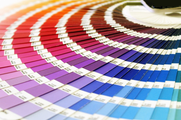
“Pantone” and “HKS” are colour mixing systems. Their inventors sell these special formulas to ink manufacturers all over the world, who in turn buy pigments, varnishes and additives and mix the printing ink. All good printing companies mix their own Pantone inks from 12 basic colours, because the result is an optimum match with the paper surface.
Pantone reserves the right to produce and market binding colour gamuts, which provides printing companies, graphic designers and agencies with a colour reference system. With Pantone, ink based on the same formula is printed on two very different paper families – “coated” = C” paper and “uncoated = U” paper.
Accordingly, there are two types of colour gamut. The reason: The same colour can look very different on different surfaces. This is linked to the refraction of light (= the effect of colour on the eyes). It is important to be aware of this in order to adjust a design in terms of paper and ink, thus avoiding disappointment at the production stage.
The Pantone colour gamuts achieve a great colour intensity. Often, it is not easy for printing companies to match this high level of inking. Experience and know-how are clear advantages in this context.
HKS offers colours with the addition N (for Natural or uncoated paper) and A (for Art printing, a relatively old-fashioned term for uncoated paper). Different formulas exist for both colour families. However, within the colour gamuts, they ought to look as similar as possible. For many printing companies, HKS is therefore less difficult to work with.
Paper such as Metapaper EXTRAROUGH are particularly suitable for printing on colour areas with special colours, creating a great visual impact without cloud formation.
Inks in neon or pastel colours, offset metallic inks
Inks in neon colours used in offset printing (or more precisely: fluorescent inks) are based on special pigments. Only a limited selection is available: Yellow, orange, pink, green and blue.
The fluorescent effect is only achieved if a lot of colour is applied (double inking). The inks can be mixed or overprinted during the printing process. This can lead to very unusual, attractive effects. Varnish eliminates the fluorescent effect and should be avoided.
Inks in pastel colours (Pantone pastels) are based on special basic colours. They complement the Pantone spectrum, yet are difficult to print. Please check with the printing company before using these colours.
Offset metallic inks are based on a mix of the two basic colours silver and gold, which render the metallic effect to the inks. The Pantone gamut shows a series of mixing options with different colours, which leads to a very special gloss effect on coated papers.
There is no separate Pantone gamut for printing on uncoated (natural) paper. On these papers, metallic inks do not achieve a gloss effect, but an attractive shimmer. Colour application also needs to be very generous. Metallic inks are the only offset inks that are non-transparent.